Chapter 5 Results
5.1 Energy Sources by Continents
Across the globe, countries are joining the movement towards renewable energy sources. Grouping by continents, we look at 5 main sources of energy: natural gas, coal, nuclear and renewables, measured in Million tonnes of oil equivalent (Mtoe) in 2018 as a PCP chart using the GGally package. Each line is colored by their continents on the right, and the corresponding countries are listed on the left. The main trends are as follows:
- European countries tend to rely less on oil, natural gas and coal (non-renewables) compared to counterpart countries in Asia Pacific and North America.
- African, Middle Eastern, Central American and CIS (Commonwealth of Independent States) countries generates the least energy across all spectrums of energy sources, with the exception of countries such as Brazil relying on renewables and Russia relying on natural gas.
- North America, mainly the US, generates the most energy across oil, natural gas and nuclear energy. The only country that matches the US in terms of volume is China, which generates the most energy across coal and renewables.
5.2 A Closer Look at Solar and Wind Energy
Renewable energy = Solar + Wind + Others (Hydro, Biomass, Biofuels).
One of the largest proportions and fastest growing sources of renewable energy is Solar and Wind. Focusing on these two, we measure how countries performed in 2018 using a Cleveland dot plot on Countries versus Energy Generation (Terawatt Hours), faceted on their Continents.
The main trends are that Europe as a whole tends to rely on Solar/Wind energy consistently; whilst individual countries such as US, China, Brazil, Germany, Japan have contributed the most Solar/Wind energy by a large margin compared to the rest in their corresponding Continents. Japan is the only country that has a higher generation of Solar energy as compared to Wind energy by a relatively large margin.
# Plot cleveland
ggplot(renewables_generation_df, aes(x = generation, y = reorder(country, generation))) +
    geom_line(aes(group = country)) +
    geom_point(aes(color = energy_type)) +
    facet_grid(continent ~ ., scales = "free", space = "free") +
    geom_text(data = right_label, aes(color = energy_type, label = round(generation, 0)), size = 3, hjust = -.5) +
    geom_text(data = left_label, aes(color = energy_type, label = round(generation, 0)), size = 3, hjust = 1.5) +
    labs(title = "Solar and Wind energy across Countries and Continents in 2018", subtitle="Source: BP Statistical Review of World Energy 2019") +
    ylab("") +
    xlab("Energy generation in Terawatt hours (TWh)") +
    xlim(0, 400) +
    theme_dotplot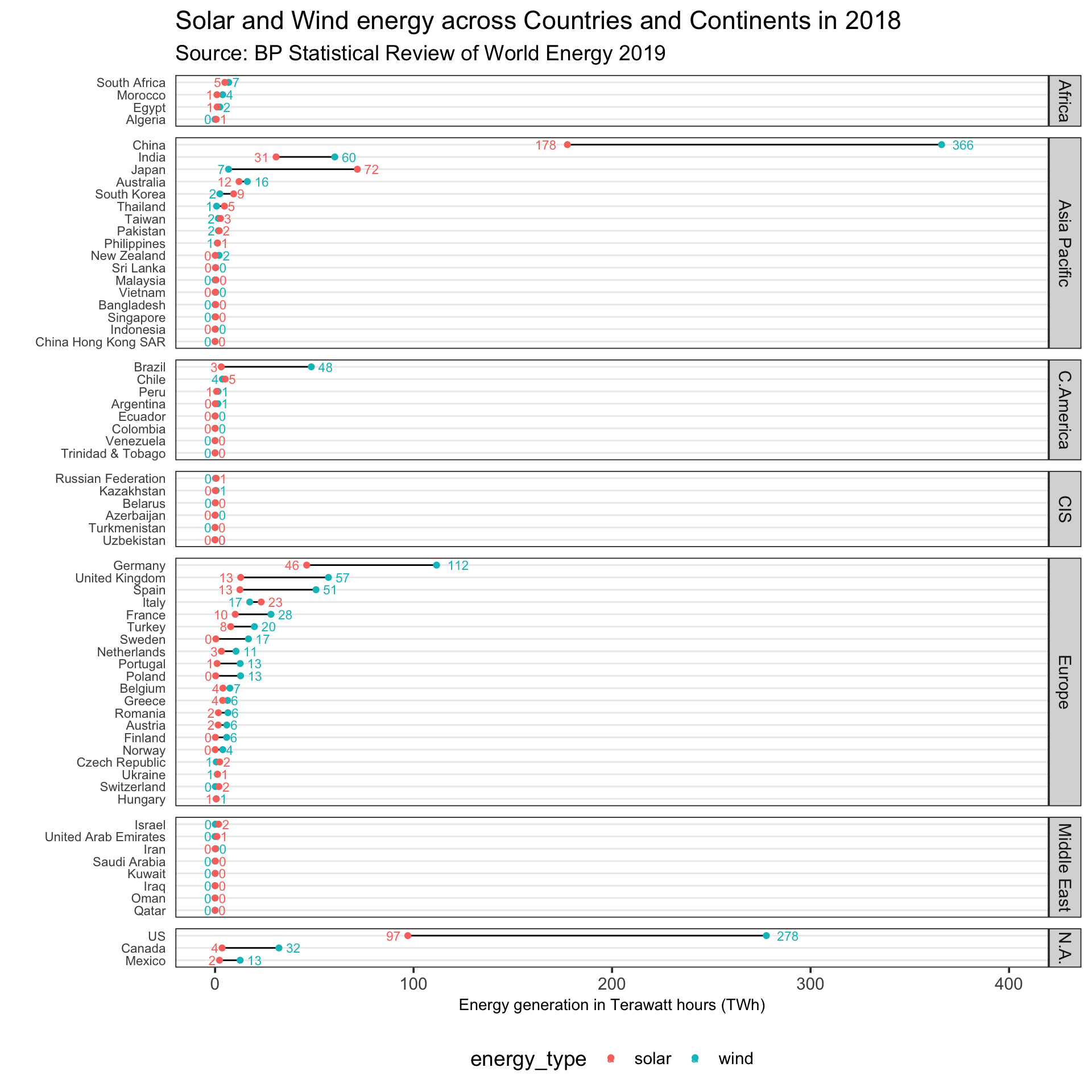
5.3 Emissions and Renewables
Overall, CO2 emissions have been steadily increasing across the globe.
Focusing on a specific country, we can see that the United States’ CO2 emissions have also been increasing, with slight occasional drops.
ggplot(df[df["country"] == "United States",], aes(x=year, y=co2)) +
  geom_line(color="darkred", size=1) +
  ggtitle("US CO2 Emissions 1965-2018") +
labs(x = "Year", y = "CO2 Emissions (millions of tonnes)") 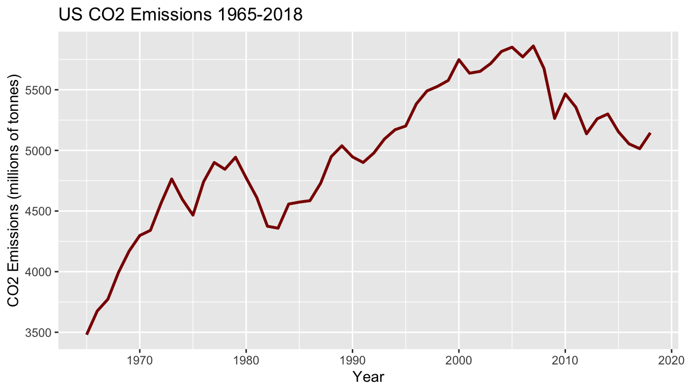
Intuitively, the increase in emissions correlates with the growth of the United States. As population and industry increases, emissions end up increasing due to the increased power demand of the country. However, if we look at the amount of CO2 generated for each unit of power produced for the US, a different image appears.
ggplot(df[df["country"] == "United States",], aes(x=year, y=emission_power_ratio)) +
  geom_line(color="darkgreen", size=1) +
  ggtitle("US CO2 Emissions Ratio 1965-2018") +
labs(x = "Year", y = "CO2 Emissions Ratio (millions of tonnes/TWh)") 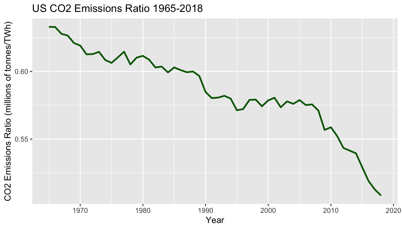
This plot shows that the United States’ emissions ratio (millions of tonnes of CO2 emitted per each TWh generated) has been decreasing throughout time. This decrease implies that the US is becoming more CO2 efficient when generating power and can be due to a variety of factors, such as switching to more renewable energy sources and increasing the efficiency of both renewable and non-renewable energy generation. We can see the relationship between the decreasing emission ratio and switching to renewable energy sources by plotting the US’s renewable ratio, which is the percent of energy consumed that was generated from renewable sources.
ggplot(df[df["country"] == "United States",], aes(x=year, y=renew_energy_ratio)) +
  geom_line(color="darkblue", size=1) +
  ggtitle("US Renewable Ratio 1965-2018") +
labs(x = "Year", y = "Renewable Ratio (TWh/TWh)") 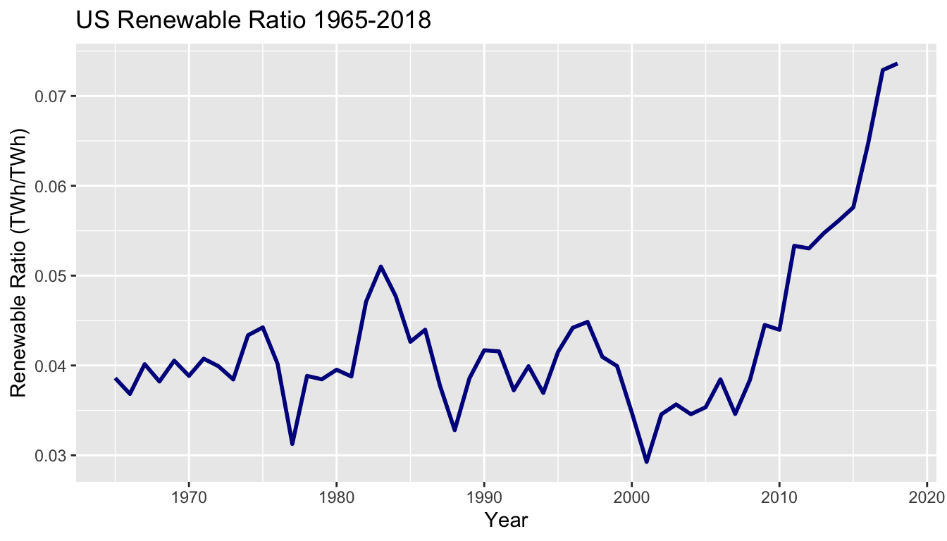
The sharp increase in the US’s renewable energy usage around 2010 seems to match with the sharper decrease in the emissions ratio. These plots show that while the US is still emitting large amounts of CO2, they are making changes to reduce the amount of CO2 released during power generation.
Interestingly, this relationship between the renewable ratio and emissions ratio appears not just in the US, but across the globe. The plot below plots each country’s yearly emissions ratio versus their renewable ratio. There is a noticeable downward trend in the plot, suggesting that as a country’s renewable ratio increases (meaning they switch to more renewable energy sources), their emissions ratio decreases (meaning they release less CO2 per unit power generated).
ggplot(df, aes(x=renew_energy_ratio, y=emission_power_ratio)) +
  geom_point(color="darkgreen", size=1) +
  ggtitle("Yearly Emissions Ratio vs Renewable Ratio") +
  labs(x = "Renewable Ratio (TWh/TWh)", y = "Emissions Ratio (millions of tonnes CO2 / TWh)")
## Warning: Removed 168 rows containing missing values (geom_point).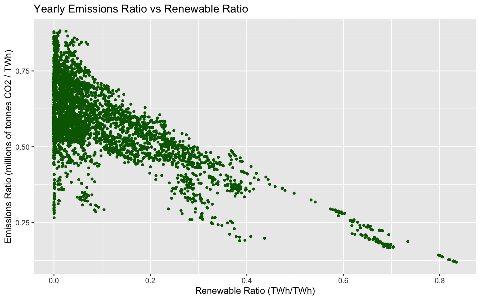
Additionally the large number of points on the left side of the plot is likely the result of countrys’ having a low renewable ratio. These countries with low renewable ratios likely won’t see a impact on their emissions as a result of renewables because of the low amount of renewable energy. As a result, there isn’t a relationship between renewables and emissions when renewables is close to zero, so the emissions ratios for these low renewable energy countries varies widely. However, when moving toward higher renewable ratios, the downward trends begins appearing.
5.4 Why did CO2 emissions in China grow?
Events:
China joins the World Trade Organization around 2001, giving rise to higher demand in exports and higher consumption in coal energy to keep up with global productions, causing CO2 to rise.
In 2014, China expands into more renewable energy and nuclear power; reducing demand for coal factories and causing CO2 to fall.
In 2017, higher demand for exports caused coal consumption to increase and surpass renewables, causing CO2 to rise.
Increasing Renewables => Reduces demand for Coal => Reduces CO2 emissions.
Source: https://www.carbonbrief.org/guest-post-chinas-co2-emissions-grew-slower-than-expected-in-2018
china_df %>%
  ggplot(aes(time, China,)) +
    geom_line(color="darkred", size=1) +
    geom_vline(xintercept = 2001) +
    geom_vline(xintercept = 2014) +
    geom_vline(xintercept = 2017) +
    annotate("text", x = 1998, y = 8000, label = "Event 1") +
    annotate("text", x = 2011, y =6000, label = "Event 2") +
    annotate("text", x = 2020, y =4000, label = "Event 3") +
    ggtitle("Total CO2 Emissions 1965-2018 in China") +
labs(x = "Year", y = "CO2 Emissions (millions of tonnes)") 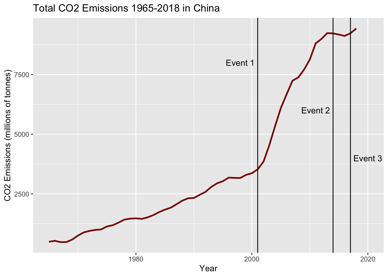
5.5 Relationship between Renewable Energy and Finance/Business Situation in Countries
We have looked into the global trends of renewable energy production and consumption. As an underlying factor of global trends, we hypothesize that financial and business situations of countries affect renewable energy usage. Therefore, we will analyze these relationships in the next section.
The questions we focus on are the below:
Global Financial Trends of Renewable Energy Usage
- How much are countries investing on renewable energy?
- How much are countries being invested on for renewable energy?
Global Business Trends of Renewable Energy Usage
- Is there a relationship between the number of companies (headquarters) and renewable energy usage rates?
- Is there a relationship between manufacturing (Industrial Production Rate) and renewable energy usage rates?
5.5.1 How much are countries investing on renewable energy?
The graphs below show the investment towards renewable energy.
investment <- ggplot(invest_renew_df) +
  aes(x=reorder(country, investment_2018), y=investment_2018, fill=continent) +
  geom_col() +
  ggtitle('Investment on Renewable Energy by Country') +
  labs(x='Country', y='Investment (Billion USD)') +
  theme(plot.title = element_text(hjust = 0.5)) +
  coord_flip()

investment_ratio <- ggplot(invest_renew_df) +
  aes(x=reorder(country, investment_gdp_ratio_2018), y=investment_gdp_ratio_2018, fill=continent) +
  geom_col() +
  ggtitle('Investment to GDP Ratio per Country') +
  labs(x='Country', y='Investment to GDP Ratio (USD/USD x 1/1000)') +
  theme(plot.title = element_text(hjust = 0.5)) +
  coord_flip()

grid.arrange(investment, investment_ratio, ncol=1)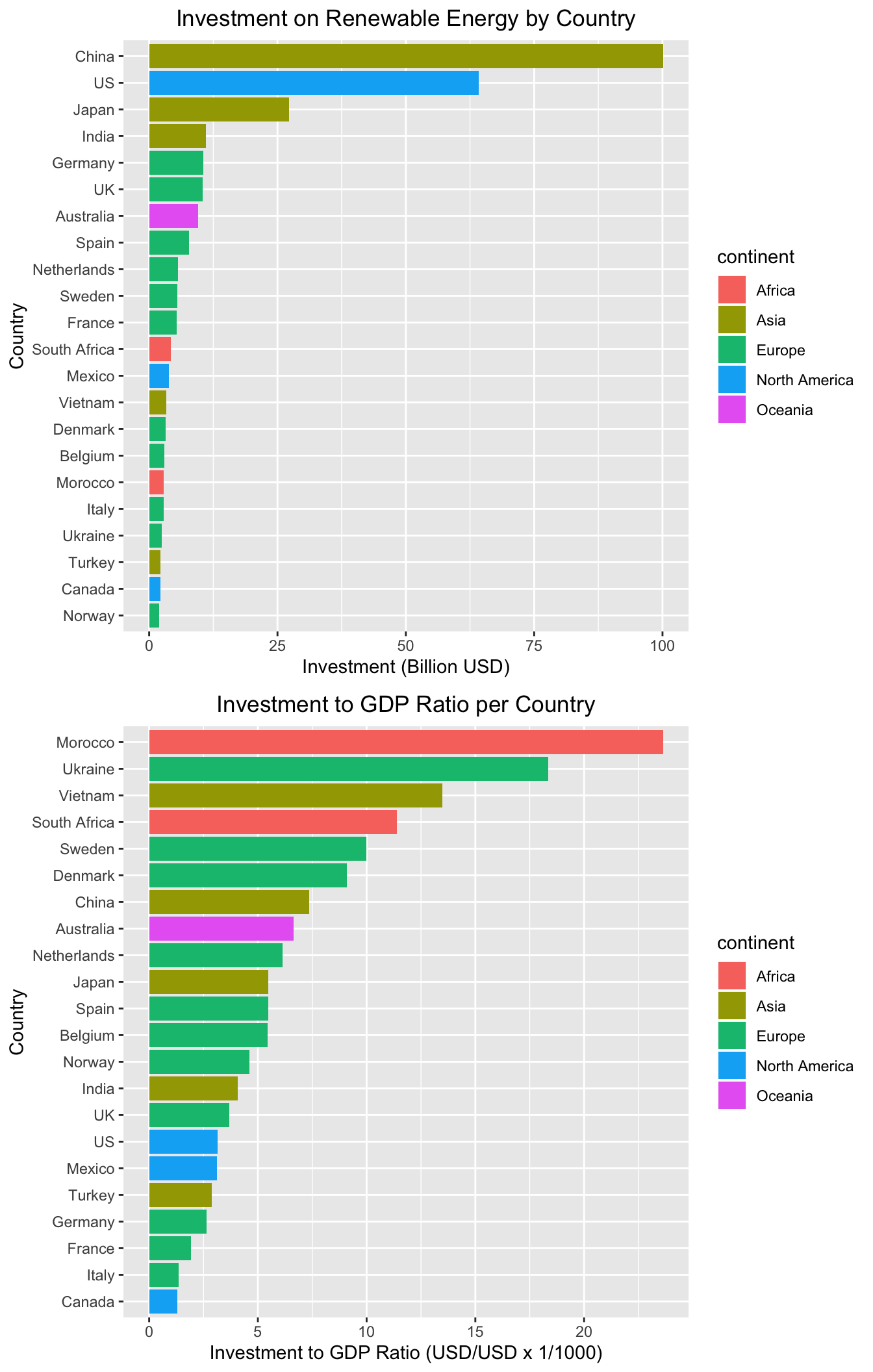
First of all, note that these countries only include the relatively more developed countries. Of these countries, countries like China, United States, and Japan invest a great amount of money towards renewable energy. On the other hand, many countries in Europe seem to invest lower amounts of money. But this relationship changes after changing the scale of the investment by dividing it by the GDP of each country. In the first bar plot, the countries Morocco and Ukraine were near the lower end of the plot, but in the second bar plot, Morocco and Ukraine become countries with high investment to GDP ratio. This means that despite their GDP, they are putting in more effort towards the investment of renewable energy compared to other countries. China also has a relatively high investment to GDP ratio, which means that they are putting in a lot of effort for renewable energy investment both in quantity and quality.
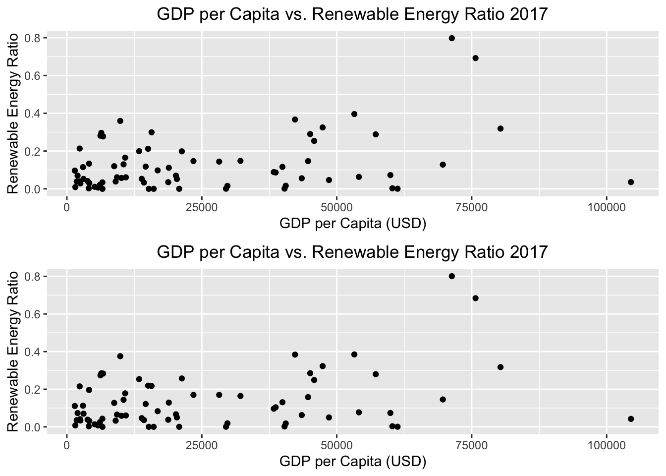
Taking a deeper look into the relationship between GDP and renewable energy, we plot the GDP in US Dollars and the renewable energy ratio of each country for the years 2017 and 2018. The renewable energy ratio is the amount of renewable energy generated by each country divided by the total amount of energy that was consumed by each country, and this value can be thought to represent how much the country has invested so far into renewable energy.
gdp1 <- ggplot(renew_gdp_pop_df) +
  aes(x=gdp_2017, y=renew_ratio_2017) +
  geom_point() +
  ggtitle('GDP vs. Renewable Energy Ratio 2017') +
  labs(x='GDP (Trillion USD)', y='Renewable Energy Ratio') +
  theme(plot.title = element_text(hjust = 0.5))

gdp2 <- ggplot(renew_gdp_pop_df) +
  aes(x=gdp_2018, y=renew_ratio_2018) +
  geom_point() +
  ggtitle('GDP vs. Renewable Energy Ratio 2018') +
  labs(x='GDP (Trillion USD)', y='Renewable Energy Ratio') +
  theme(plot.title = element_text(hjust = 0.5))

grid.arrange(gdp1, gdp2, ncol=1)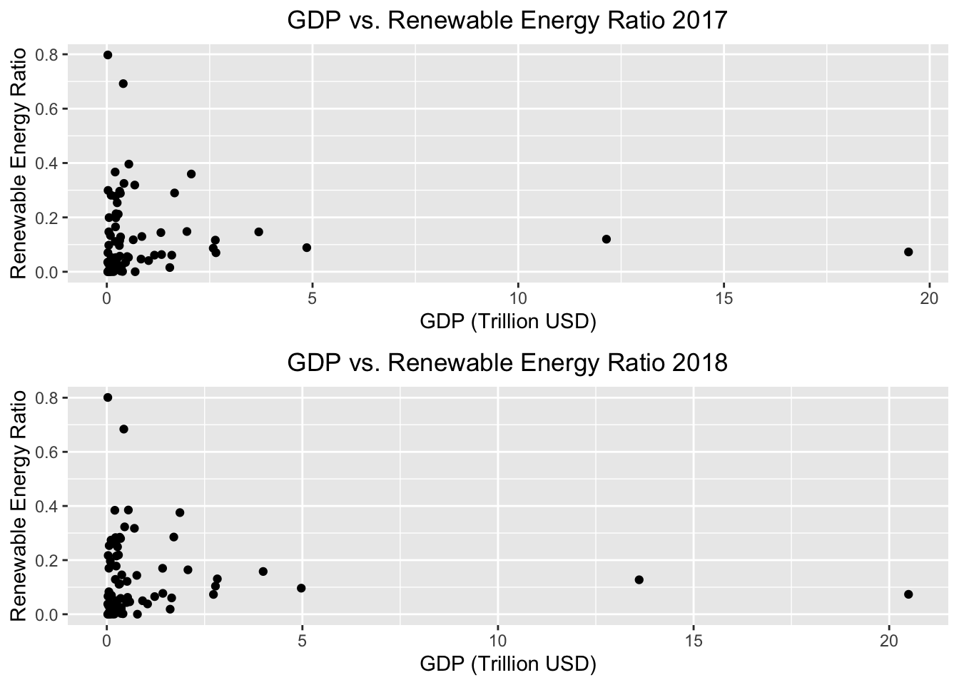
x_gdp_2017 <- renew_gdp_pop_df %>% select(gdp_2017)
y_gdp_2017 <- renew_gdp_pop_df %>% select(renew_ratio_2017)
cor(x_gdp_2017, y_gdp_2017)
## renew_ratio_2017
## gdp_2017 -0.0424327x_gdp_2018 <- renew_gdp_pop_df %>% select(gdp_2018)
y_gdp_2018 <- renew_gdp_pop_df %>% select(renew_ratio_2018)
cor(x_gdp_2018, y_gdp_2018)## renew_ratio_2018
## gdp_2018 -0.04196668No correlation was found between the GDP and renewable energy ratio of countries. This means that regardless of how much money the country is making, or in other words, how developed the countries are, there is no connection between whether those countries generate more renewable energy or not. Since some types of renewable energy sources are known to be more expensive compared to traditional energy sources such as oil and gas, these results contradict our hypothesis. Next the GDP is regularized by dividing each country’s GDP by the population of their countries. This value is called the GDP per Capita. The data pairs are plotted below.
x_gdp_c_2017 <- renew_gdp_pop_df %>% select(gdp_per_capita_2017)
y_gdp_c_2017 <- renew_gdp_pop_df %>% select(renew_ratio_2017)
cor(x_gdp_c_2017, y_gdp_c_2017)
## renew_ratio_2017
## gdp_per_capita_2017 0.3674481x_gdp_c_2018 <- renew_gdp_pop_df %>% select(gdp_per_capita_2018)
y_gdp_c_2018 <- renew_gdp_pop_df %>% select(renew_ratio_2018)
cor(x_gdp_c_2018, y_gdp_c_2018)## renew_ratio_2018
## gdp_per_capita_2018 0.3434031From the above, a moderate positive correlation between the GDP per Capita and renewable energy ratio can be found. These results suggest that the more money a person makes on average in a country, the more likely the entire country is going to generate renewable energy. Intuitively, this is because the more money a person makes on average, the more opportunities there are for that individual to invest in renewable energy. Hence, the usage of renewable energy can be thought to be dependent on how individuals of the country commit towards renewable energy, rather than the total amount of money the country is making.
To summarize, countries with more money do not have high renewable energy usage rates, but if individuals of the country make more money on average, it is likely that there is a higher renewable energy usage rate in the country.
5.5.2 How much are countries being invested on for renewable energy?
invest_dev_df[1] <- NULL
invest_dev_df <- na.omit(invest_dev_df)
invest_dev_df <- invest_dev_df %>%
  mutate(sum_invest=X2000+X2001+X2002+X2003+X2004+X2005+X2006+X2007+X2008+X2009+X2010+X2011+X2012+X2013+X2014+X2015+X2016)
invest_dev_df <- gather(invest_dev_df, key="year", value="Millions_USD", -country, -parentName, -ISO3, -sum_invest)

invest_dev_df$year <- substr(invest_dev_df$year, 2,5)
invest_dev_df$year <- as.numeric(invest_dev_df$year)
invest_dev_df <- invest_dev_df %>% filter(sum_invest>2000)

ggplot(invest_dev_df) +
  aes(x=year, y=Millions_USD, color=country) +
  geom_line() +
  ggtitle('Amount of Renewable Energy Investment from Other Countries') +
  labs(x='year', y='USD (Millions)') +
  theme(plot.title = element_text(hjust = 0.5)) +
  scale_colour_brewer(palette="Set3")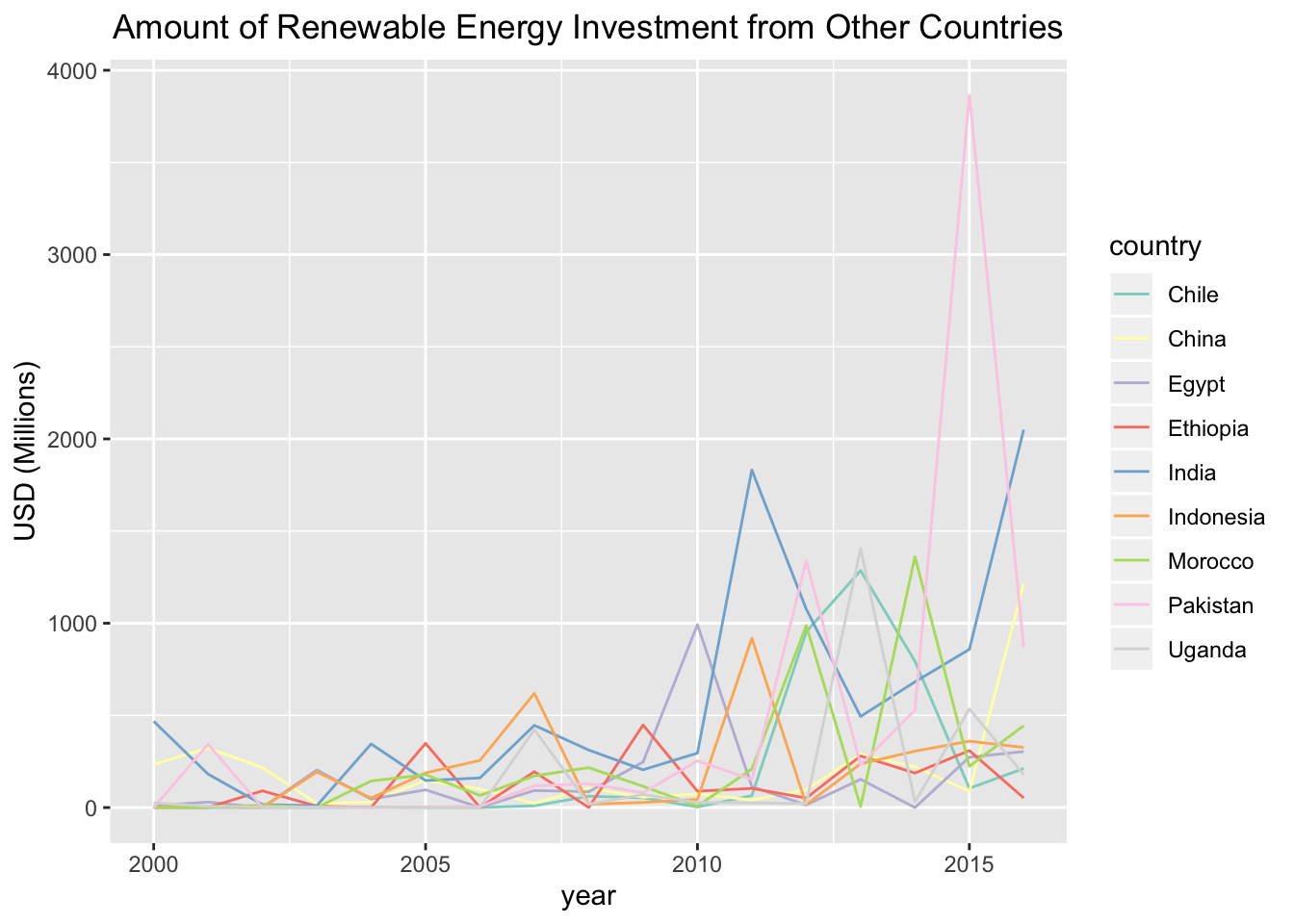
The above line graph consist of countries that had a cumulative invested sum of more than 2,000 Million USD. It seems that from 2000 to 2016, countries from Asia and Africa were invested in highly for renewable energy from around the world. There seems to be a large amount of investment to Pakistan in 2015, making Pakistan the country that was most invested in for renewable energy. Regardless of being a developed country, China is has been invested by other countries for renewable energy.
5.5.3 Is there a relationship between the number of companies (headquarters) and renewable energy ratios?
Below is a plot of the number of headquarters of companies and the renewable energy ratios.
ggplot(num_business_df) +
  aes(x=num_business_2018, y=renew_ratio_2018) +
  geom_point() +
  ggtitle('Business Count and Renewable Energy Ratio 2018') +
  labs(x="Business Count (in Millions)", y='Renewable Energy Ratio') +
  theme(plot.title = element_text(hjust = 0.5))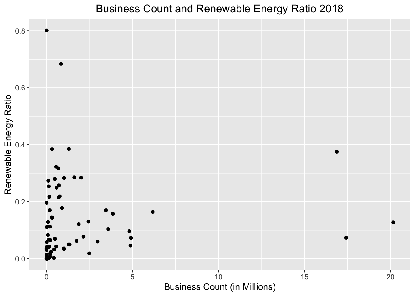
x_num_business <- num_business_df %>% select(num_business_2018)
y_num_business<- num_business_df %>% select(renew_ratio_2018)
cor(x_num_business, y_num_business)
## renew_ratio_2018
## num_business_2018 0.07474367There seems to be no correlation between the number of businesses in a country and the renewable energy ratio. The number of businesses may not have an affect on how much people are making profit or the GDP per capita.
5.5.4 Is there a relationship between manufacturing (Industrial Production Rate) and renewable energy ratios?
Below is a dot plot of the industrial production rate growth and the renewable energy ratios of each country.
ggplot(industrial_production_df) +
  aes(x=production_growth_rate_2017, y=renew_ratio_2017) +
  geom_point() +
  ggtitle('Industrial Production Growth Rate and Renewable Energy Ratio 2017') +
  labs(x="Industrial Production Growth Rate (%)", y='Renewable Energy Ratio') +
  theme(plot.title = element_text(hjust = 0.5))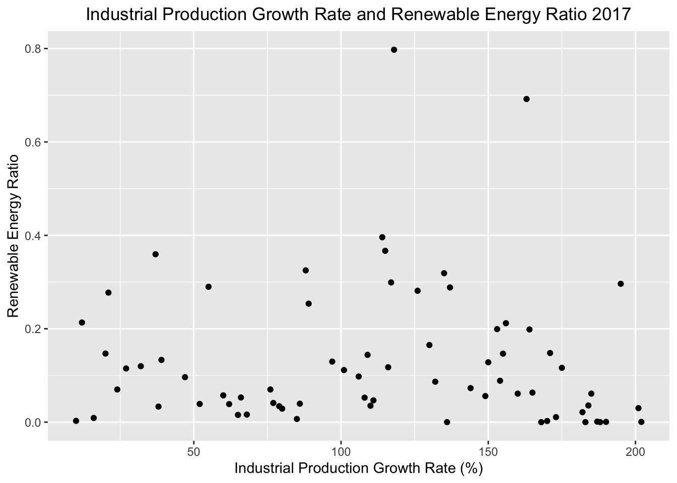
x_industrial_production <- industrial_production_df %>% select(production_growth_rate_2017)
y_industrial_production <- industrial_production_df %>% select(renew_ratio_2017)
cor(x_industrial_production, y_industrial_production)
## renew_ratio_2017
## production_growth_rate_2017 -0.02993074There seems to be no correlation between the growth rate of industrial production and the renewable energy ratio. This is an unpredicted result because generally in locations with industrial production, it can be assumed that a large amount of electricity is needed, creating demands for more electricity such as renewable energy sources.